Year
2026
Client
Heritage BFC
Website
hbfc.church
Heritage Bible Fellowship Church is a new and upcoming church plant located in Kutztown, Pennsylvania. It is the daughter church of Redeemer BFC located in Topton, Pennsylvania. Heritage needed a new logo and branding system that was not only friendly and outgoing, but a mix of traditional design mixed with a modern refresh. Much of the brand was built around the mark: an olive branch. In Christianity, this is a symbol of Christ's peace, mercy, and new life found in Jesus Christ. According to Heritage, this mark helped celebrate the heritage of grace passed down through God's Word. The mark was created before the type, which is unusual for me. I had taken a look at many commercial free fonts and was started to create my own when I found Maragsa, a beautiful serif font that paired brilliantly with the logomark. Adding some roughing to the logo and font to give it a rough cut, almost chiseled-look perfectly aligns with the traditional piece that Heritage was searching for.

Heritage Launch Flyer
Heritage's highly anticipated launch required numerous print and digital artworks across multiple media. From flyers, business cards, emails and more, the branding had to prove it was flexible but strong enough to work on multiple applications.
Upon launching, Heritage had a complete and fully working branding guideline document that pointed each designer in the right direction.
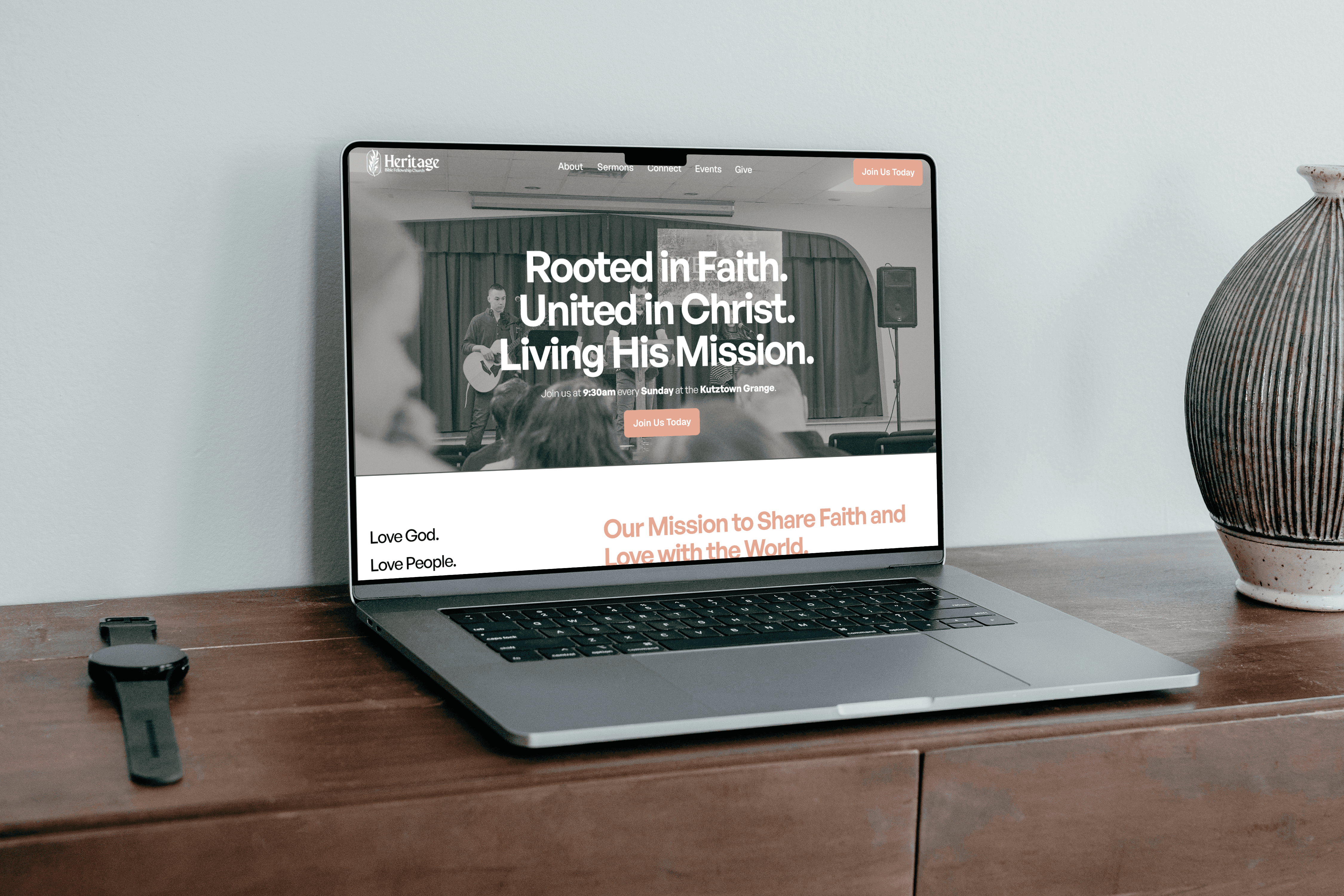
Website Refresh Mockup
A few months after Heritage got on their feet, they requested a website refresh - moving away from the church-based website software they initially launched with. Moving to a framer based-site, I completely redesigned from the bottom up, utilizing the branding guidelines I created, while maintaining the modern approach they required. The new site has a dynamic Ministry page with auto-updating calendar information, embedded code for auto-updating videos utilizing Youtube playlists, a detailed About page with individual bios, and clear wayfinding through the site.

Additional Ministry Logos
Heritage not only needed their main logo for all church applications, but also secondary logos for each of the ministries under Heritage. The main two that required logos directly after launch were Heritage Kids and Recovery Room.
Heritage Kids strayed away from the rough, traditional logo and steered to a smoothed whimsical logo set. This allowed the logo to promote a fun and active use, in contrast to the firm Heritage logo.
Recovery Room dialed the professionalism of the main logo back slightly, but still kept many of the same elements, including the olive branch. A script font was chosen to further differentiate the logo from the main mark and allow it to stand on it's own. Many times, Recovery Room is used without the full Heritage logo, so the olive branch acts as a callback to the original design philosophy.

Small Format Print
Print was a big push with Heritage. We wanted everything to look cohesive, but closely follow the brand guidelines to ensure consistency across the board.

Additional Marks & Social Media
Some shortened marks were required for watermarks and social media. The original logo shape does not lend well to circular social icons, therefore a smaller H paired with the BFC acronym was added on top of the olive branch. This allowed the logo to be recognized and called back to the original mark. The bare olive branch works very well as a corner icon, print background, or watermark.

Initial Mockups and Logo Options
While finding the perfect logo, I tested various designs, form factors, font combinations, and color palettes.